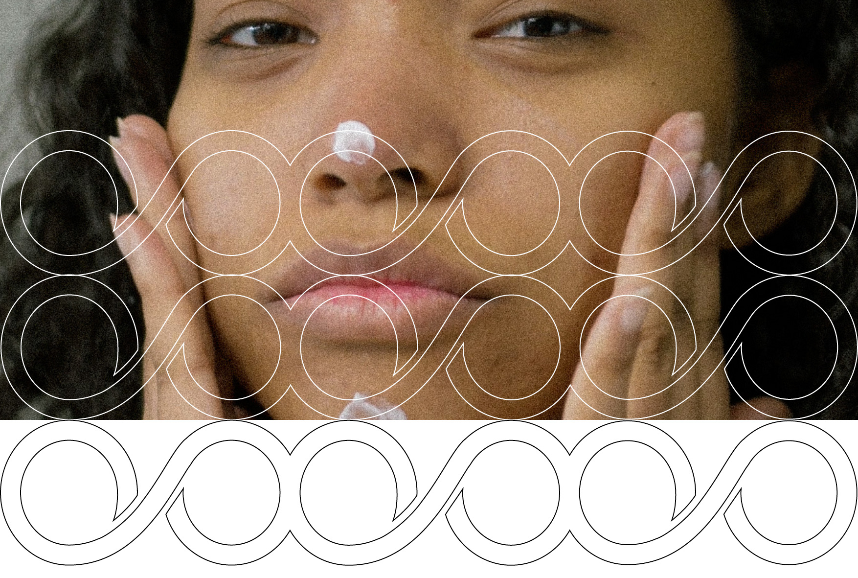
This anti-aging concept is not about stopping time, but about maintaining a sense of lightness, movement, and vitality. Aging is seen as a natural process that should be embraced with care and awareness, rather than hidden.
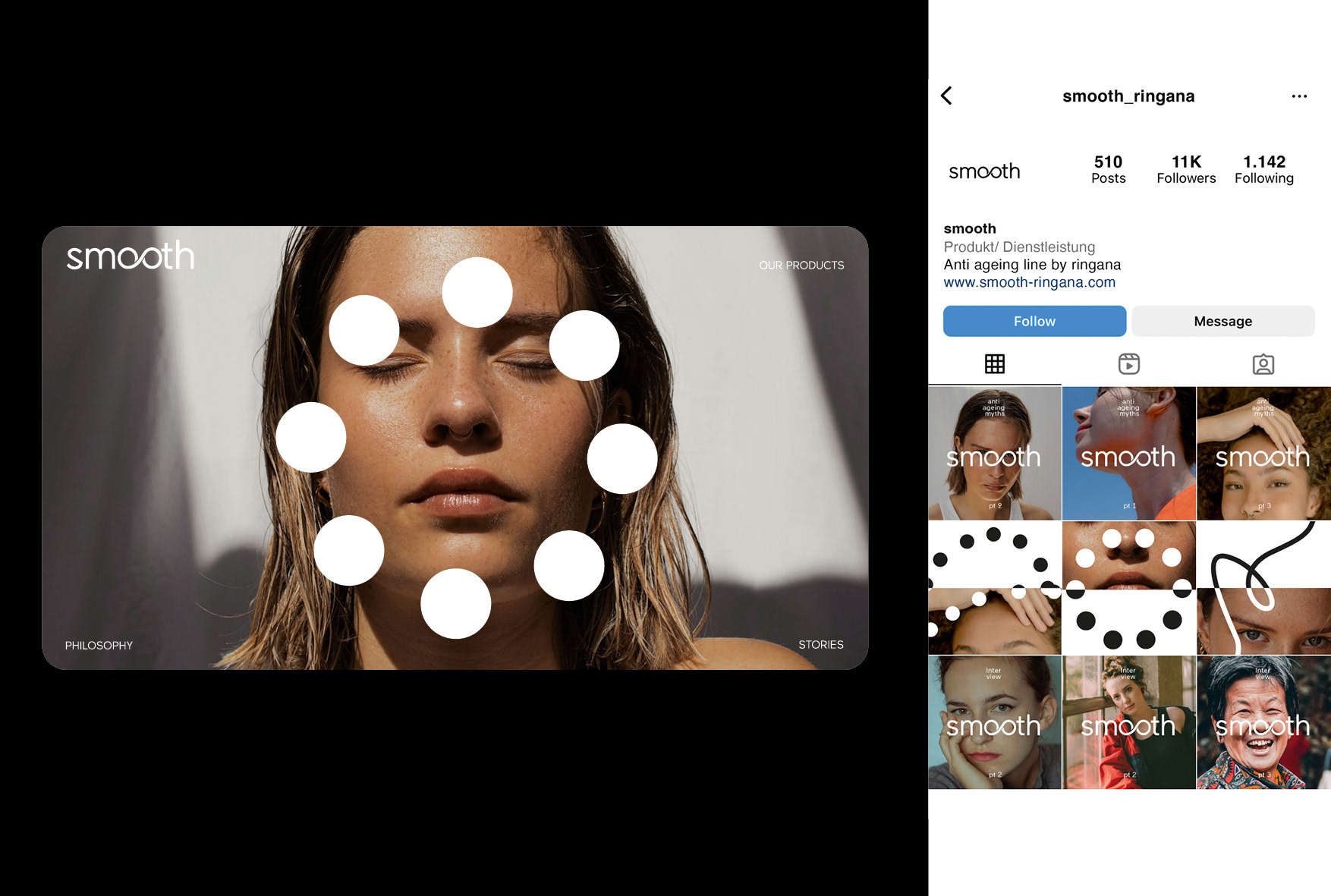
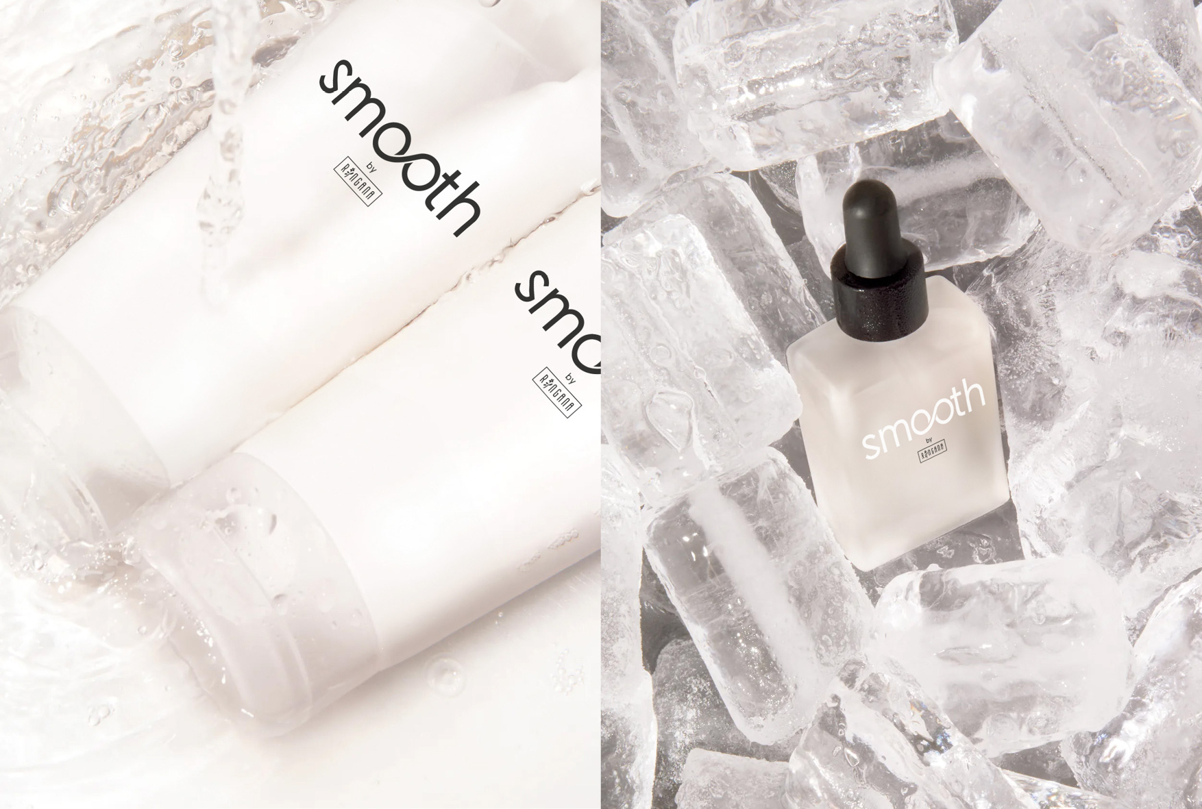
The visual approach combines soft, flowing forms with real, close-up imagery, creating a balance between structure and fluidity. Vital, organic shapes are used throughout as a key stylistic element.
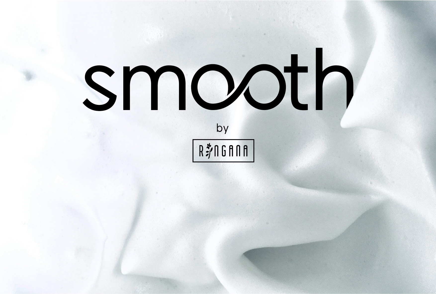
The product line is called Smooth. The logo features two connected “o” shapes forming a soft, continuous loop, symbolizing flow, continuity, and graceful aging.
The project is still ongoing.